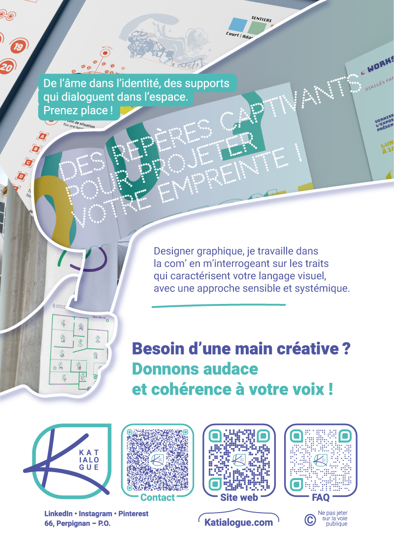
• My color code :
Turquoise for creativity, Violet for intuition, White for space – physical, compositional, and relational; ethical for freedom of expression and transparency.
• My typography :
Heebo on one hand, Katialogue on the other (not used here).
The current titles change typography depending on what they express.
• My tone of voice :
Poetic, technical, and human.
• The composition :
Volumetric elements, cutting the page like paper, evoking both art, design, modernity, and technology.
And you, what is your universe ? 🌟
Do you want to work together on a project ?
📩 Contact me via DM !
Comments